Stefan Ball
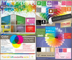
WHITE is a truthfulness, purity, clean, devotion, mild, and contemporary. White is the best color for a background color on the web.
BLACK is a elegance, boldness, power, authority, seductive, evil and classic. Black is the ideal choice for text on a light background. It is hard on the eyes when used as a background on web sites.
RED is a strength, sex, excitement, passion, speed, danger, aggressiveness, and demands attention. Red is the most emotionally intense color. It stimulates a faster heartbeat and breathing.
BLUE is a security, trust, reliability, coolness, faithfulness, belonging, and dignity. Blue is the most popular color.
GREEN is a abundance, health, fertility, freedom, healing, nature, growth, jealously, and cool. It is the easiest color on the eye.
BROWN is a effectiveness, politeness, richness, and helpfulness. Brown is the color of earth, and is abundant in nature.
PINK is a softness, sweet, femininity, well-being, innocence, and nurture.
PURPLE is a dignity, spirituality, royal, luxury, wealth, authority, mournfulness, and sophistication. In business it is upscale.
ORANGE is a playfulness, pleasure, cool, warmth, cheer, vibrant, strength, endurance, and ambition.
YELLOW is a sunshine, warmth, cheer, happiness, cowardice, and jealousy. In business it is appealing to intellectual types and is good for accents.
GOLD is a expensive, and prestige.
BEIGE is a soft neutral color that isn't quite white and has some of the earthiness of light browns. Beige represents quiet.
QEUSTION
1 Why are red, yellow, and blue called primary colors?They are the only colors that don't need a combination of the other colors to make them. The other colors come from combinations of those primary colors.
2 What are the three secondary colors and what colors are combined to create each one?Green- yellow and blue
Orange- red and yellow
Purple- blue and red
3 Explain the six contrasts often used in combining color schemes on a web site.The 1st three contrasts are complimentary. That means the colors are opposite of each other. The 4th contrast is the warm-cold contrast. The Light-Dark Contrast is where you take lighter and/or darker colors of a specific color in a layout.
4 How can you vary color through the use of gradients?You can vary color through the use of gradients by using white on a color or using black.
5 What is the difference between analogous color and complementary color?Analogous colors are next to each other on the color wheel. Complementary colors are across each other on the color wheel.
6 From the third and fourth websites, what are five important tips about using color on the web?Using less color is more. Complementary colors don't complement. Use contrasting colors. Monochromatic – is when you create an imaging using only tints and shades of one color. A simple color wheel is the most critical tool you can use in order to mix colors.